Primary Logo
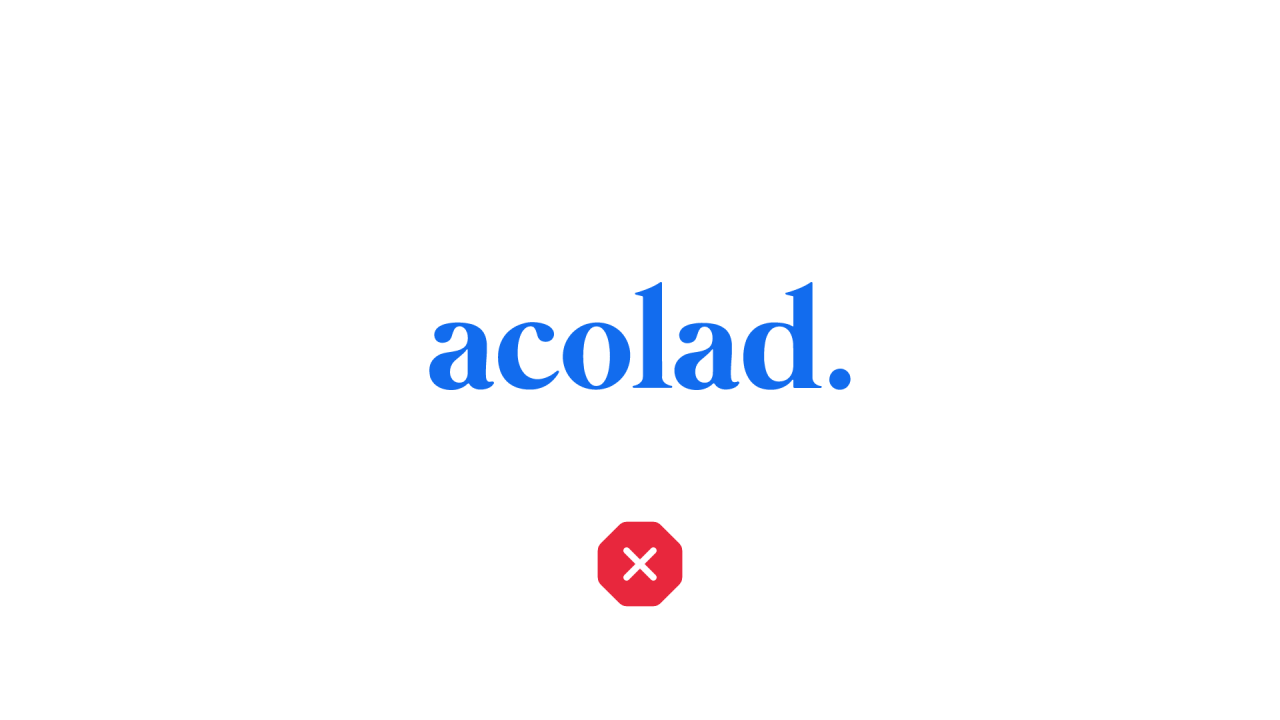
The primary Acolad logo is available in two color schemes: Zodiac Black and White. The Zodiac Black version works best on a white or light background. The white version should be used on dark backgrounds. The choice should always be evaluated for optimal contrast.
Simple Mark
Our simple mark (secondary logo) is also available in two color schemes: Zodiac Black and White. It can be contained in a square or seamlessly. The Zodiac Black version works best on a white or light background. The white version should be used on dark backgrounds. The choice should always be evaluated for optimal contrast.
Only use the simplified mark as a substitute for the primary logo if there is additional context that allows users to associate it with the Acolad brand. An example of OK use is on our social media feed as this mark will always appear next to the HTML text easily identifying "Acolad" as a company.
Logo Requirements
Clearance
Make sure logos are easily visible by surrounding them with adequate padding that's free of text, graphics, or any other elements that could create visual clutter.
Minimum clearance requirements:
Sizing
Logo Misuse
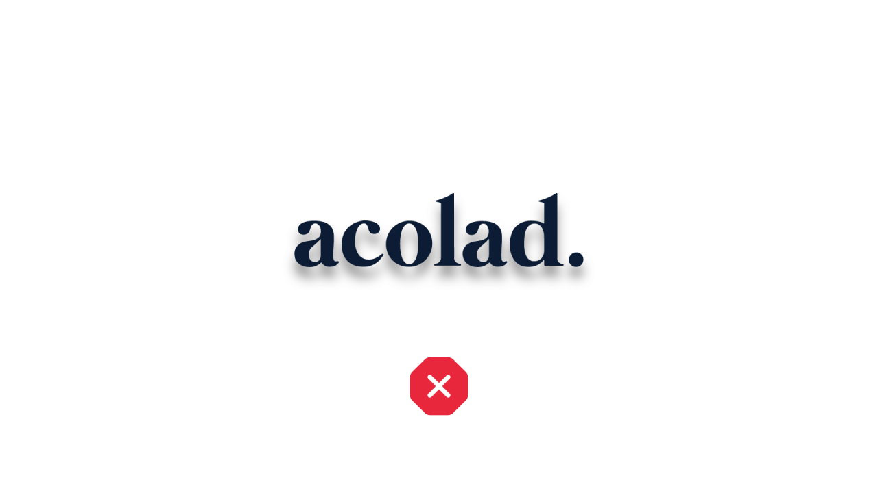
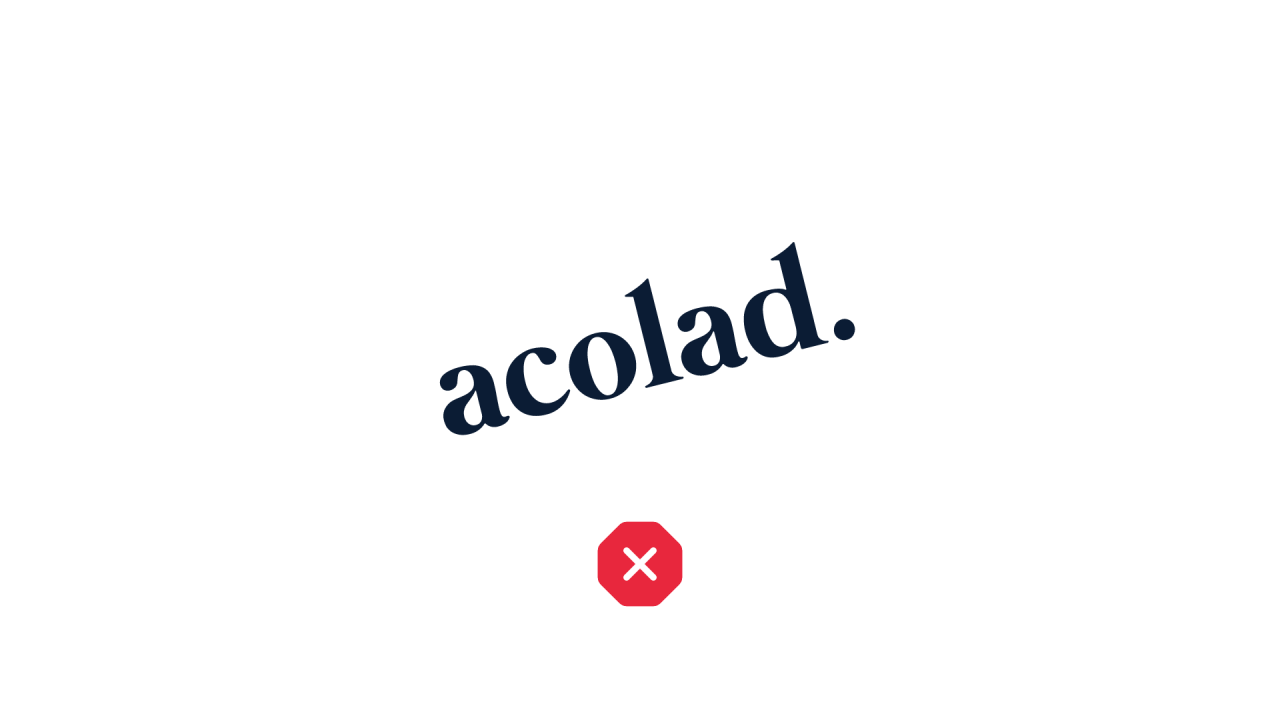
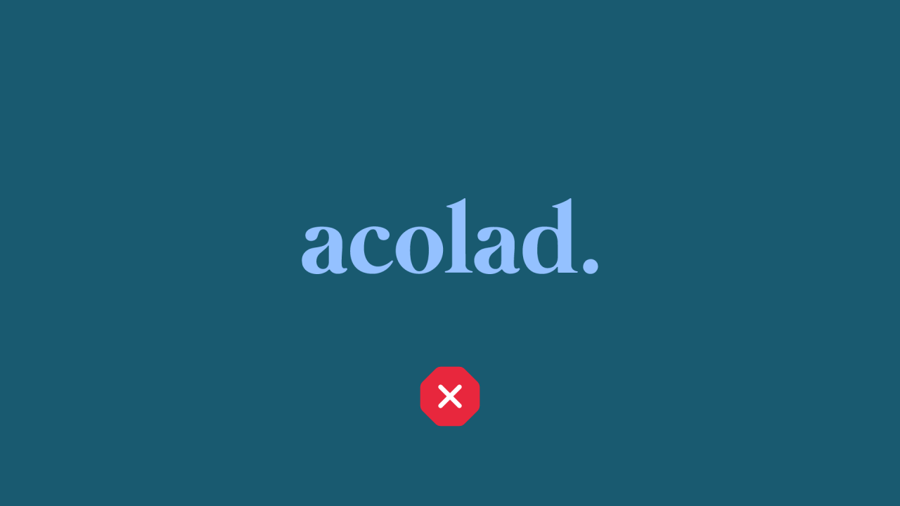
To maintain the integrity and to promote the consistency of the brand, please do not alter the Acolad Logo or Simple Mark under any circumstances without Marketing approval. This includes color changes, stylistic effects like drop shadows, personalized or seasonal flourishes, etc.